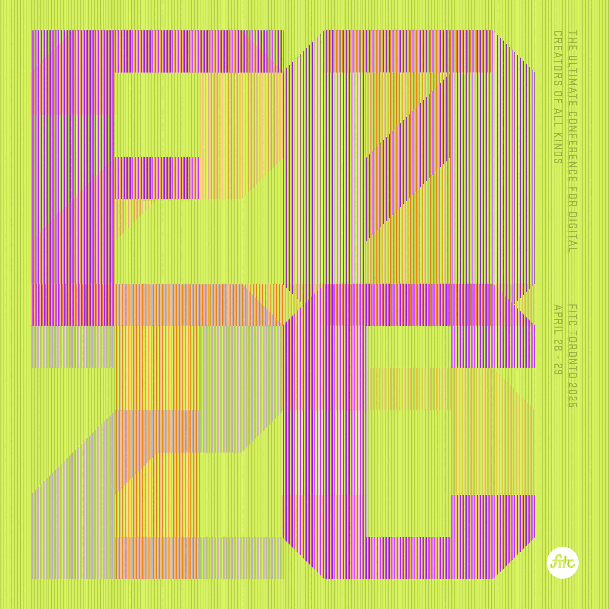
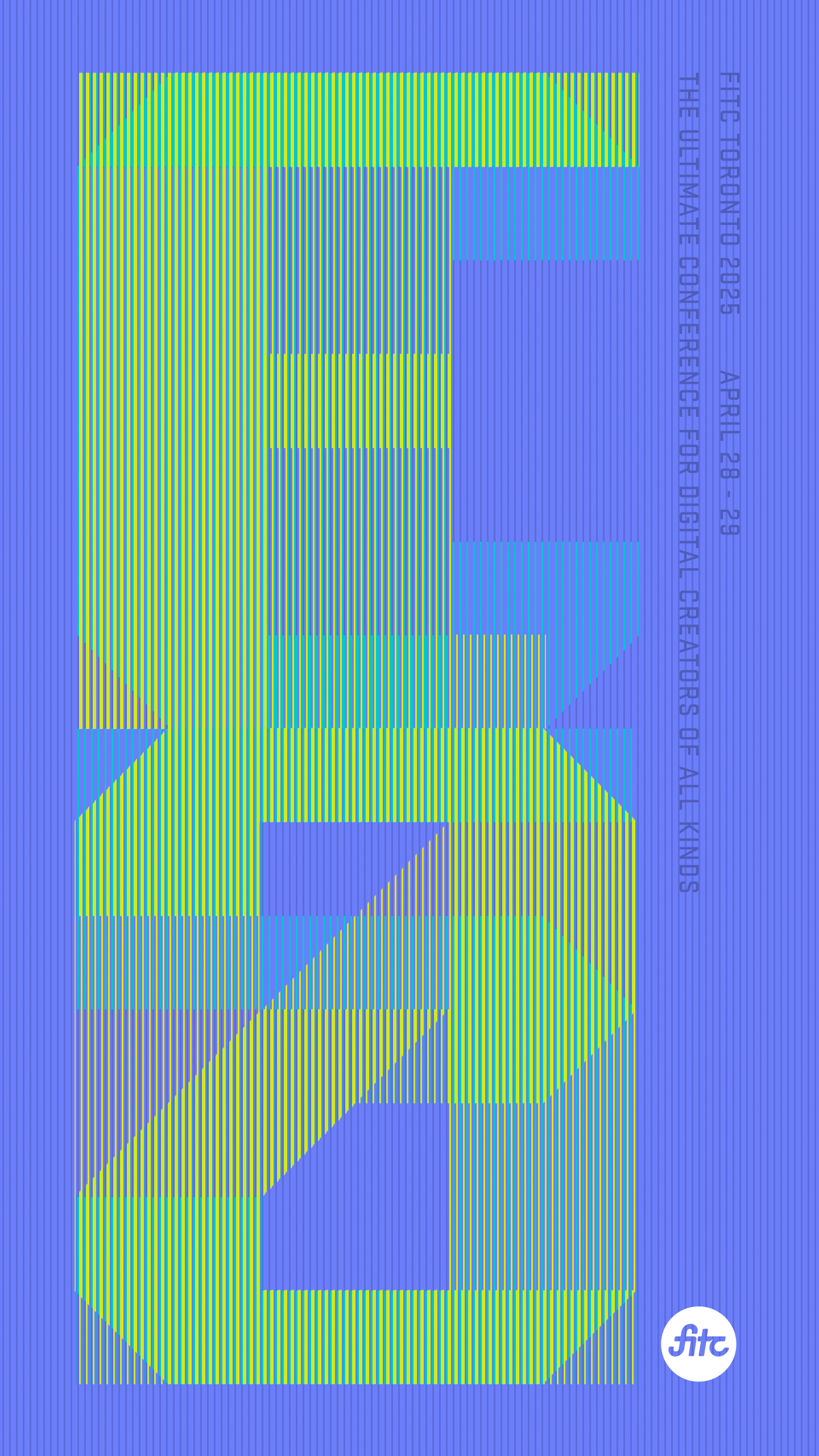
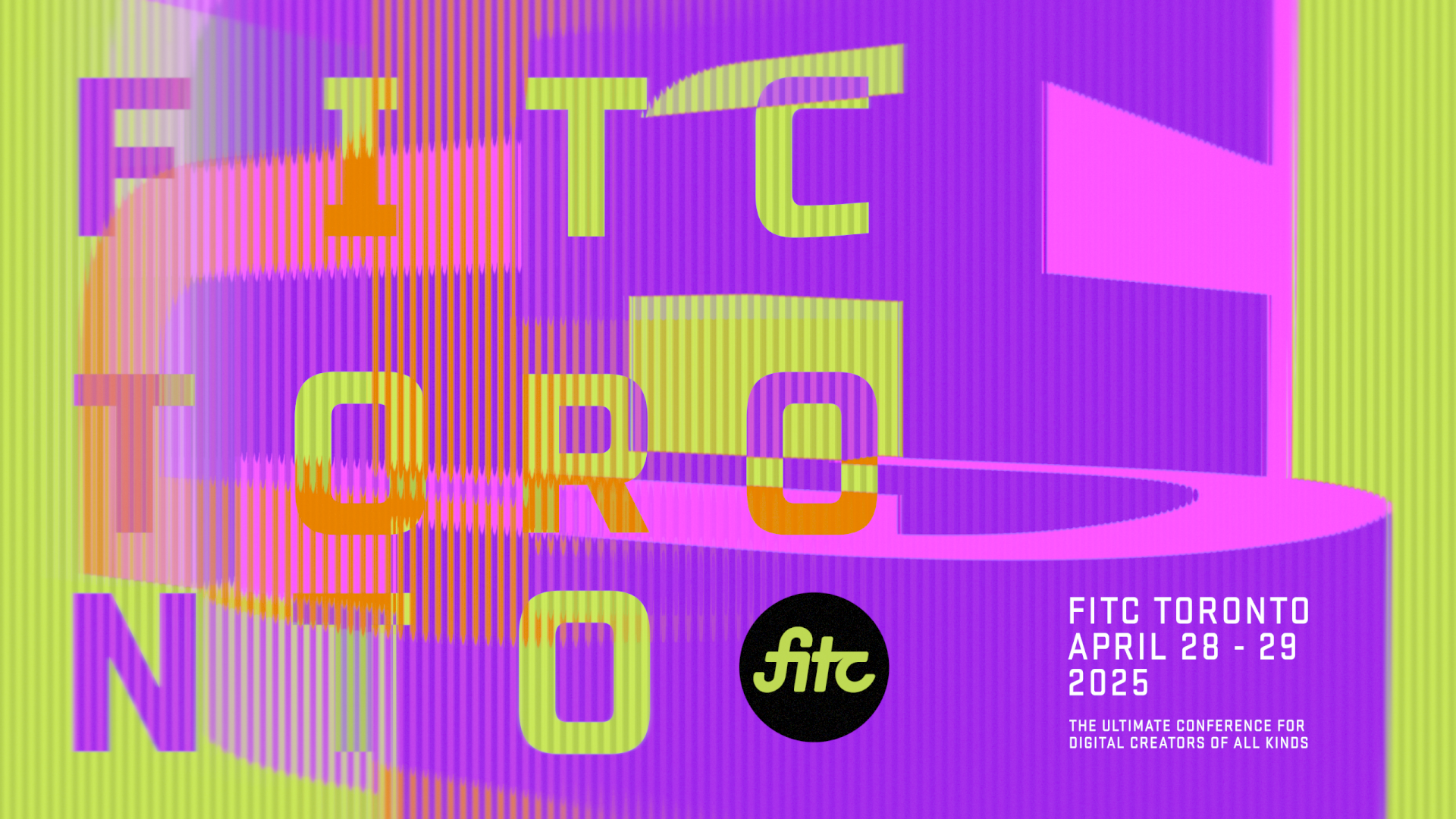
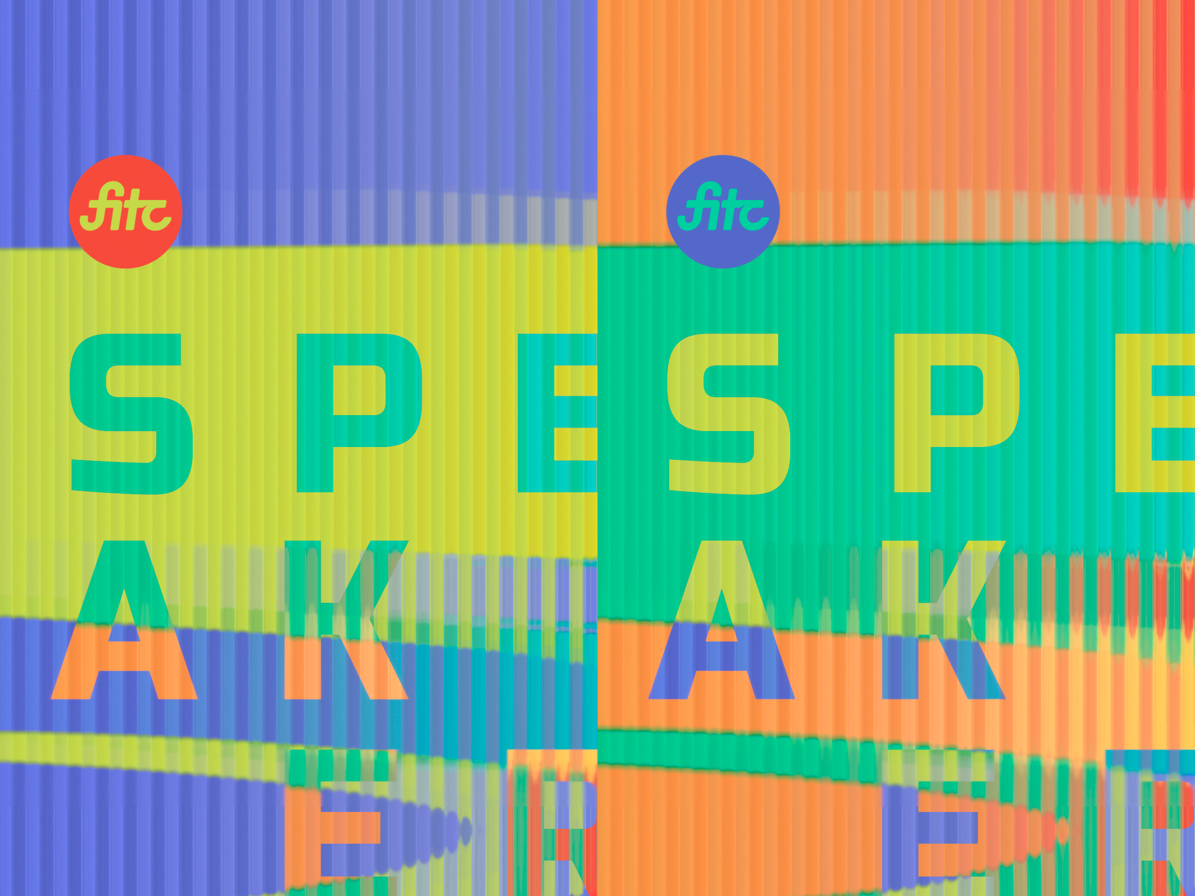
FITC TORONTO - 2025
Motion graphics | Design | Animation
In 2025 we were presented with the opportunity to create the opening titles for FITC Toronto, a yearly conference that aims to inspire, educate, and connect digital creators around the globe.
This year’s theme: Resonance served as our inspirational foundation. Present in a variety of fields, it can refer to the quality in a sound of being deep, full, and reverberating, the ability to evoke or suggest images, memories, and emotions, a quality of richness or variety, an oscillating force or a frequency close to an object or system’s own natural frequency, or the short-lived excited state of a more stable particle, among many other things.
Title Sequence
Mission Statement
“To craft a cohesive narrative that resonates with artists and audiences alike”
Brainstorming
The search for community, inspiration, understanding, meaning is as universal as any. We chose to represent this search as a series of trials, errors, and occasional successes. While we felt it best in this context to depict this search through the lens of the creative, it was our goal to create a sequence steeped in enough layers of symbolic resonance that a viewer from any background or perspective would be able to identify with the message being conveyed.
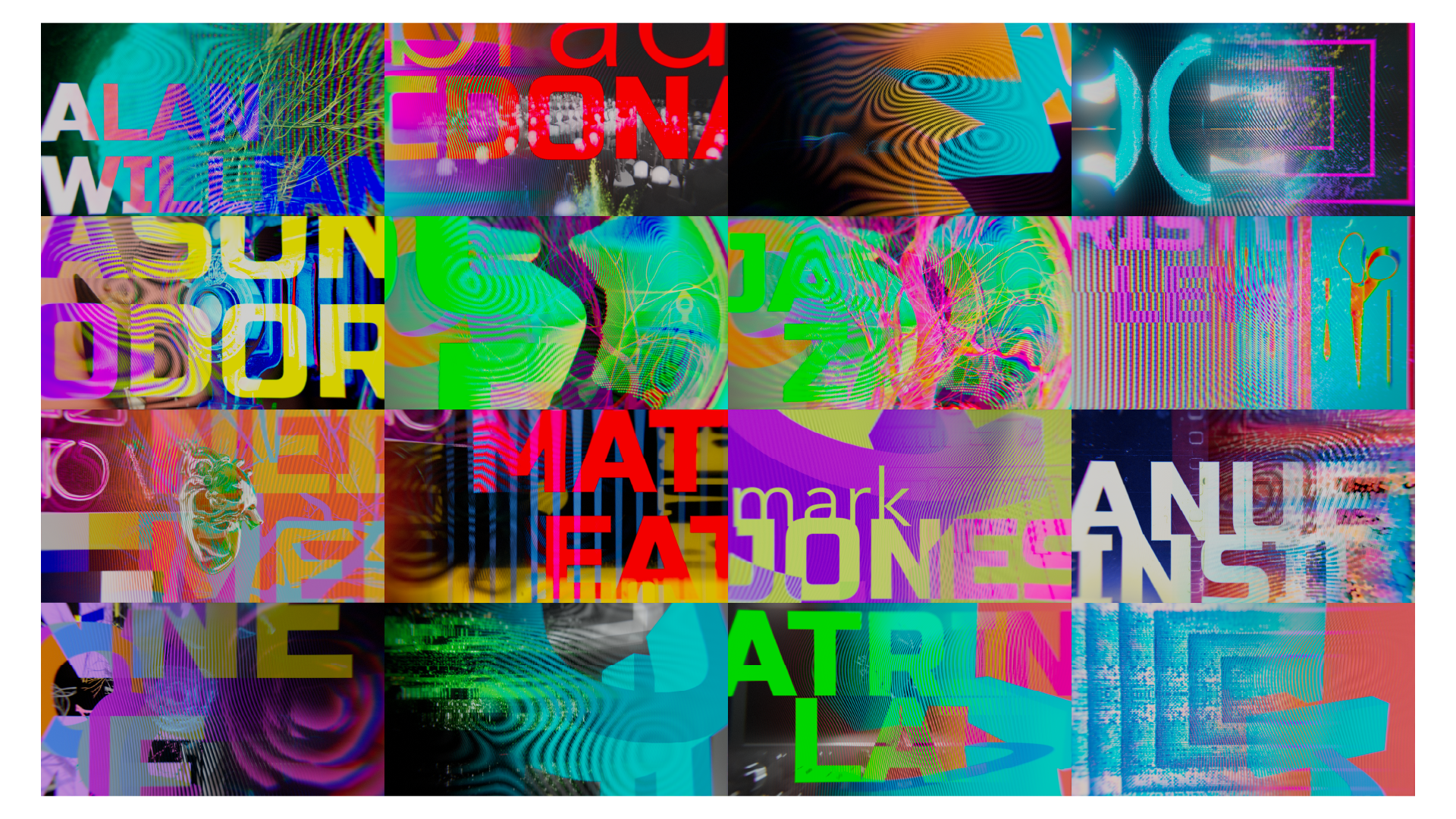
Inspiration, Influence, & Experimentation
R&D

The Effect
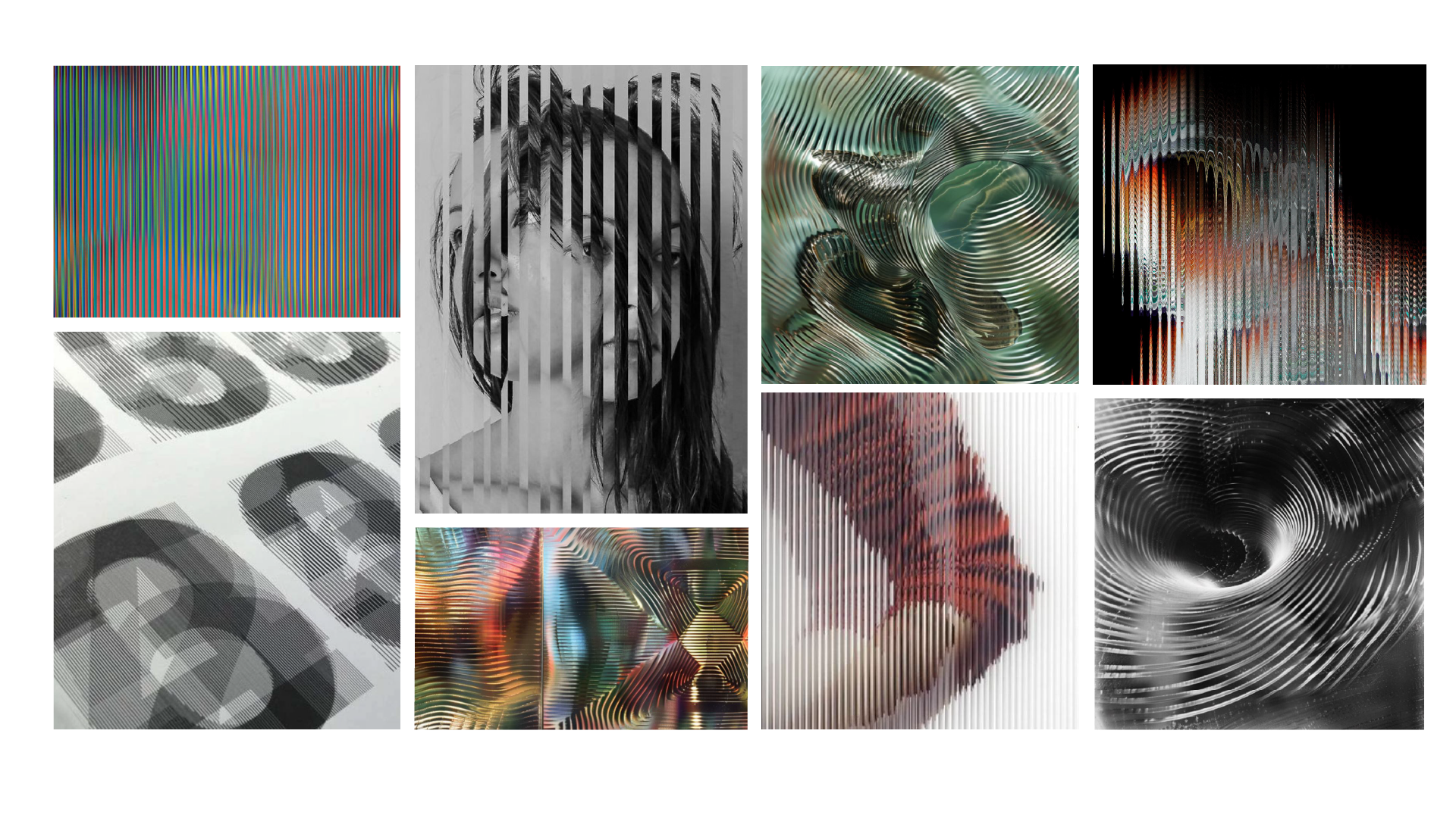
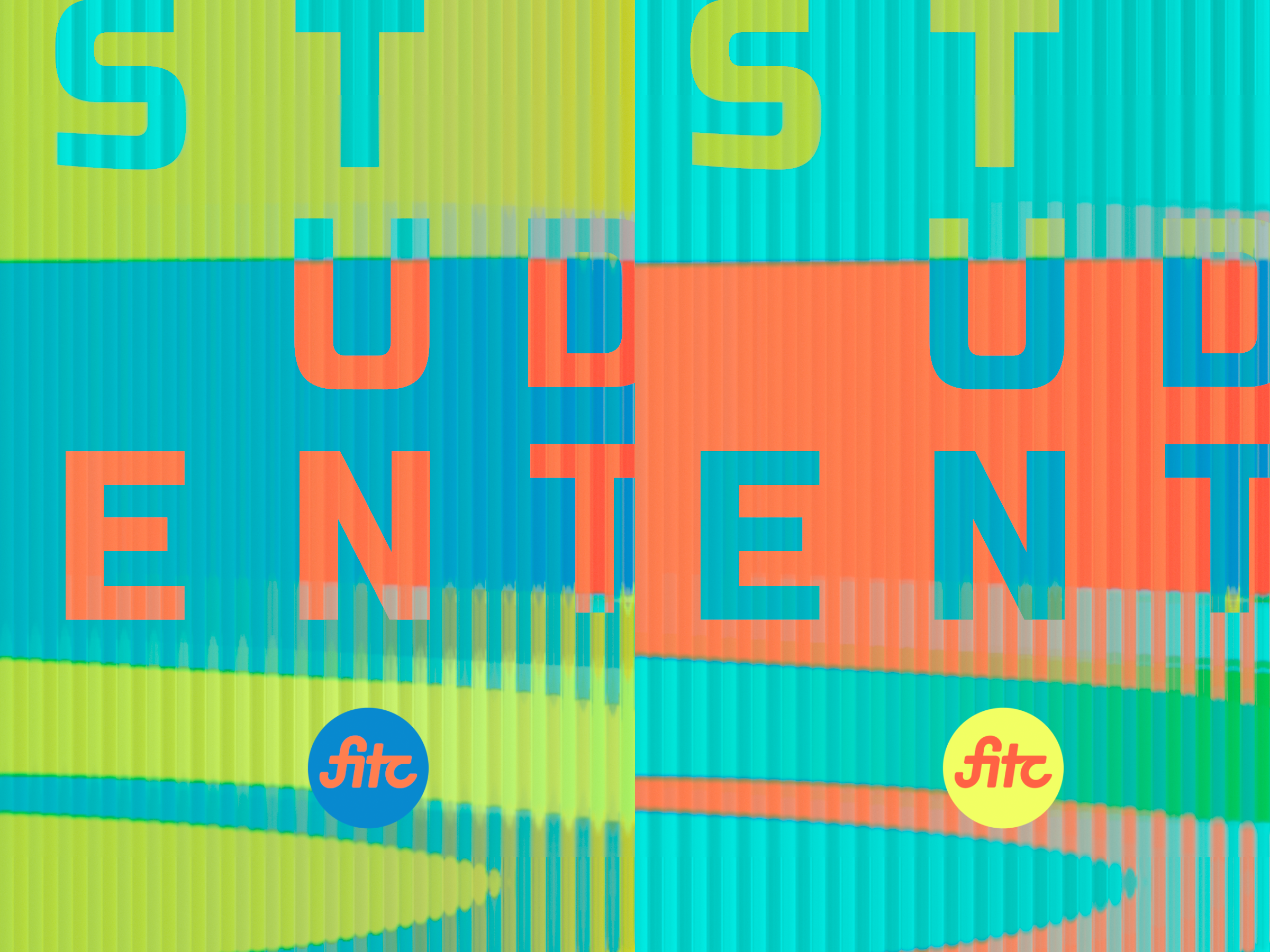
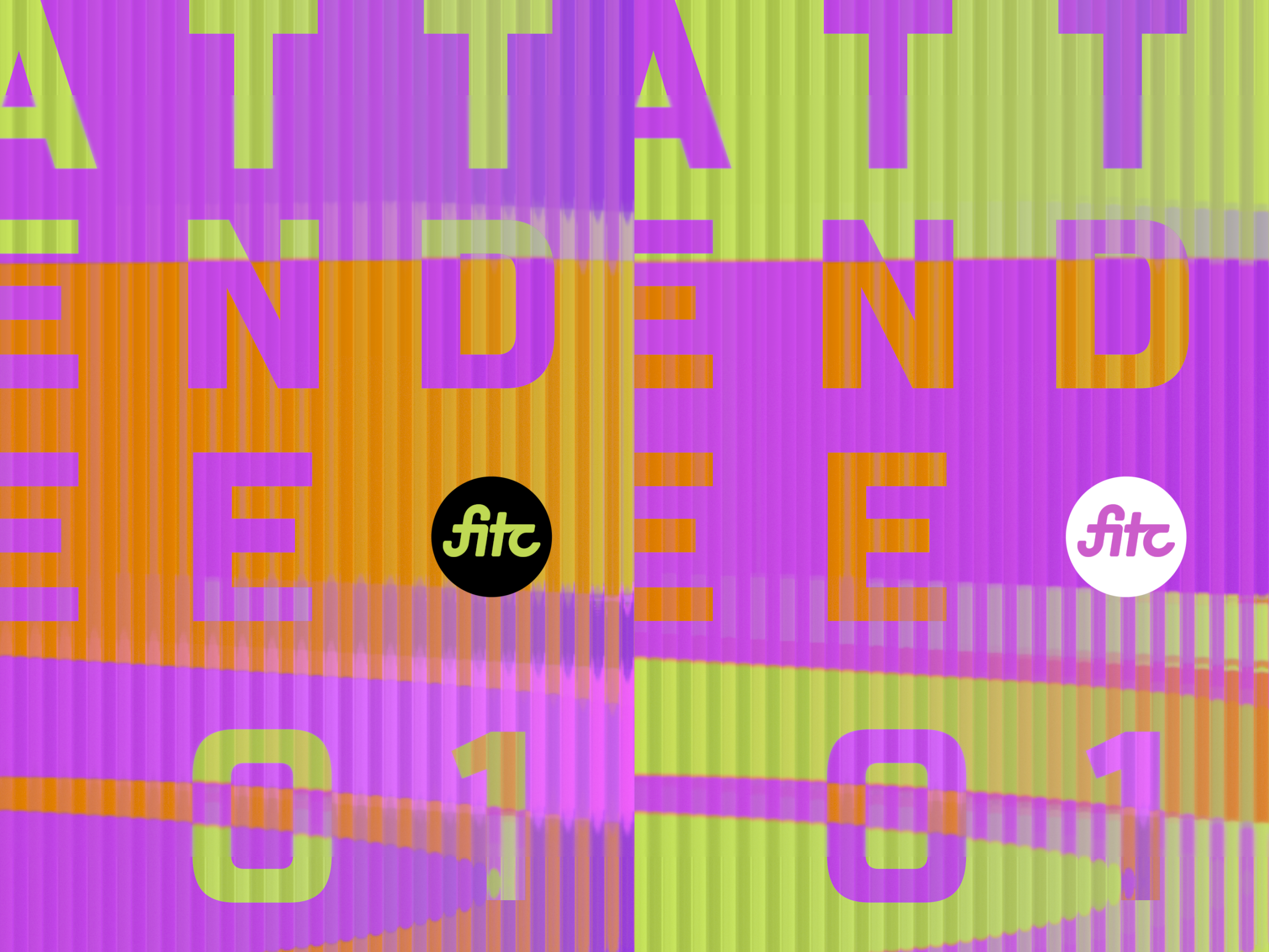
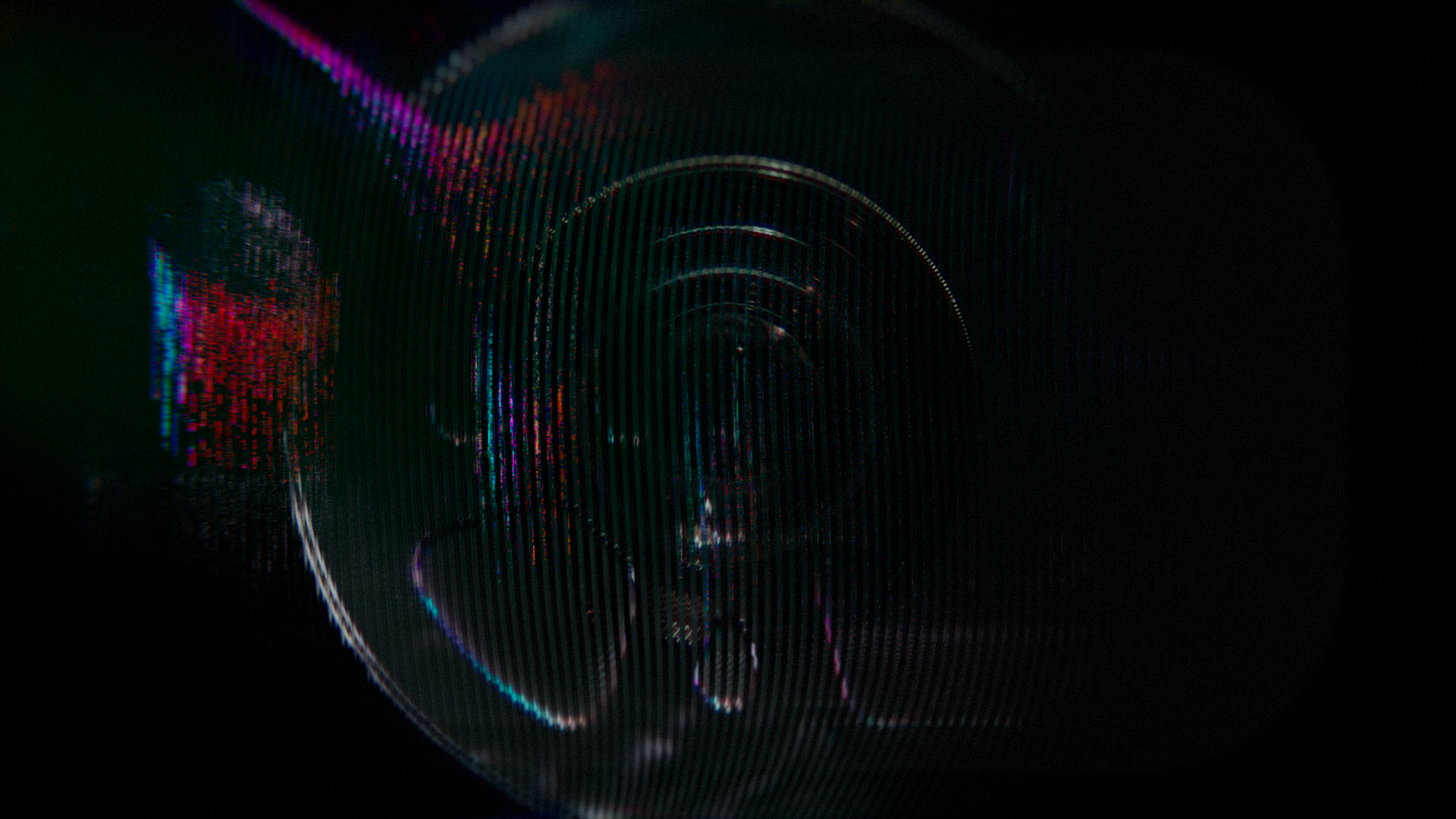
Standing wave imagery is very common when considering resonance as a scientific concept. An obvious influence to draw on, the shape of these waves gave way to the idea of the lenticular effect, which requires a lens of a similar structure, and to the exploration of opposites inspired by the waves nodes and antinodes.

Lenticular printing relies on a combination of interlaced imagery and a lensed plastic sheet to create its effect. Most if not all practical lenticular prints are arranged vertically, the technique we chose to use to represent resonant or near-resonant imagery. Non-resonant imagery was visualized by distorting the lenticular channels themselves.
We knew it would be important to show moments that were so incredibly anti-resonant that they broke the illusion entirely. We were particularly drawn to the idea of the glass or plastic channels melting or fogging away as we lost our grip on what exactly we were searching for in the first place.


Print & Promotion
Design


Story & Meaning
Design
We also knew that this piece would rely heavily on its soundtrack, so we chose our music first, and let that guide our storyboarding. Calm, still moments in our soundtrack were paired with more resonant imagery, whereas more chaotic moments were used to drive our sequences of antiresonance.


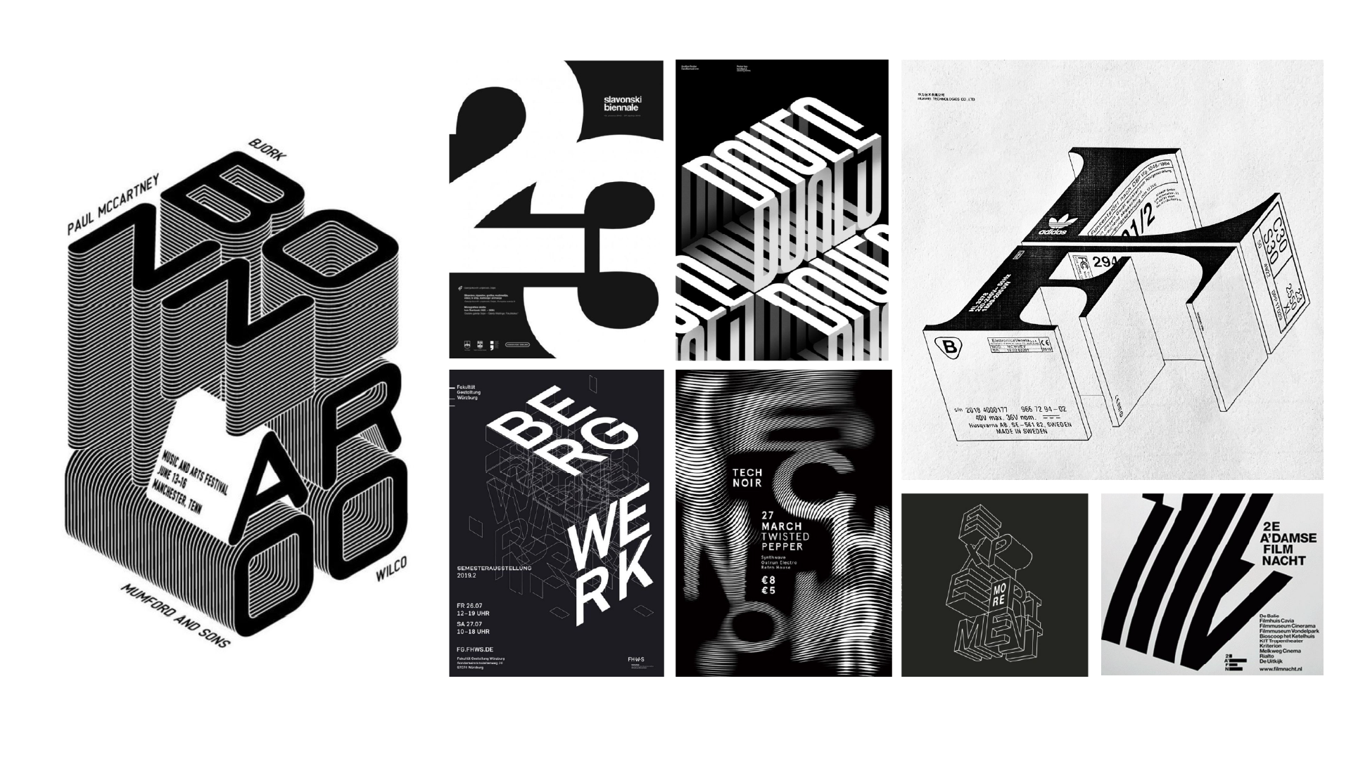
Modes of Creation
We chose to explore imagery related to “Modes of Creation or Display”. In other words: Any tool that an artist would use to create or display their work, with the terms “tool” and “artist” defined broadly.

The example here combines:
a vinyl record; the record being the mode, the artist being the musician
a phenakistoscope; the scope being the mode, the artist being the animator. The phenakistoscope being a very primitive form of animation aims to draw the parallels through time just as much as through discipline
a butterfly, of which the tool and the artist could be interpreted in a number of ways.

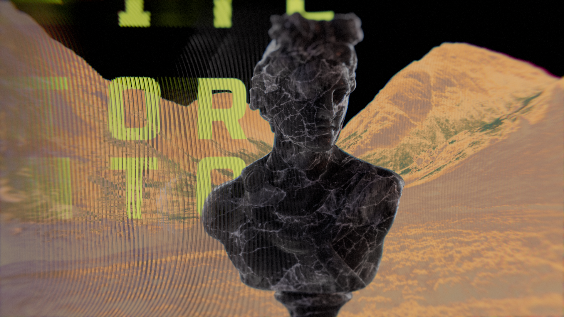
In one of our more symbolic scenes, we attempted to speak to the sadness and frustration of self-expression, as well as the incredible perseverance and bravery of the creative in their attempts to connect.
The art stands alone in front of an indifferent audience. It’s stripped away to reveal the artist - a solitary beating heart, its mirrored finish reflecting what its created, though slightly out of sync.
Despite being its creator, the heart has still not achieved true resonance with what it’s made, but it beats on.

Foreshadowing
We incorporated pieces of foreshadowing - hints at what would be our final resonant image. This universal search is not without its subject. The foreshadowing imagery represents the fact that those on this journey so often do catch glimpses of what they’re seeking, even if they are not full aware of it in the moment.

We also included a lengthy section of chaos, leading into our final imagery. This chaos represents the scramble and desperation of seeking resonance after engaging in the long and often exhausting process of testing methodically before finally landing on the work that truly resonantes.

Credits List
Client FITC
Art Director Carly Cerquone
Executive Producer Donna Cullen
Artists Aaron Eaton, Julianne Dome, Matt Eaton