LOVE DEATH + ROBOTS
Screen Graphics | Design
Tablet Graphics
Design and Animation
The Very Pulse of the Machine
Being a massive fan of Jean "Moebius" Giraud, the brief for this project was a joy to receive. The stylized approach of the episode offered a unique and welcome challenge. We were tasked with creating dynamic designs that stood out visually from the vibrant surroundings but still felt grounded and functional, communicating the important story beats along the way. I’m really pleased with the final outcome, and grateful to Cantina and Blur for having me along to contribute to the Love Death + Robots legacy.
Designer Kristoffer Brady

“Voyaging through strange eons of thought.”
Mason’s Rats
Working on Mason's Rats was particularly fun because we had to think in a print format and work within those boundaries. Because of that, the approach was a bold, graphic-heavy design that had clear call to actions and very punchy visuals. Our thought process was that these advertisements needed to grab someone's attention when flipping through a magazine.
The TT15 had an ominous approach, but followed a similar design language with the graphics and typography. We wanted it to feel mysterious, premium... like it was the ultimate solution to Mason's Rat problem.
Designer Ramiro Galan
Kill Team Kill
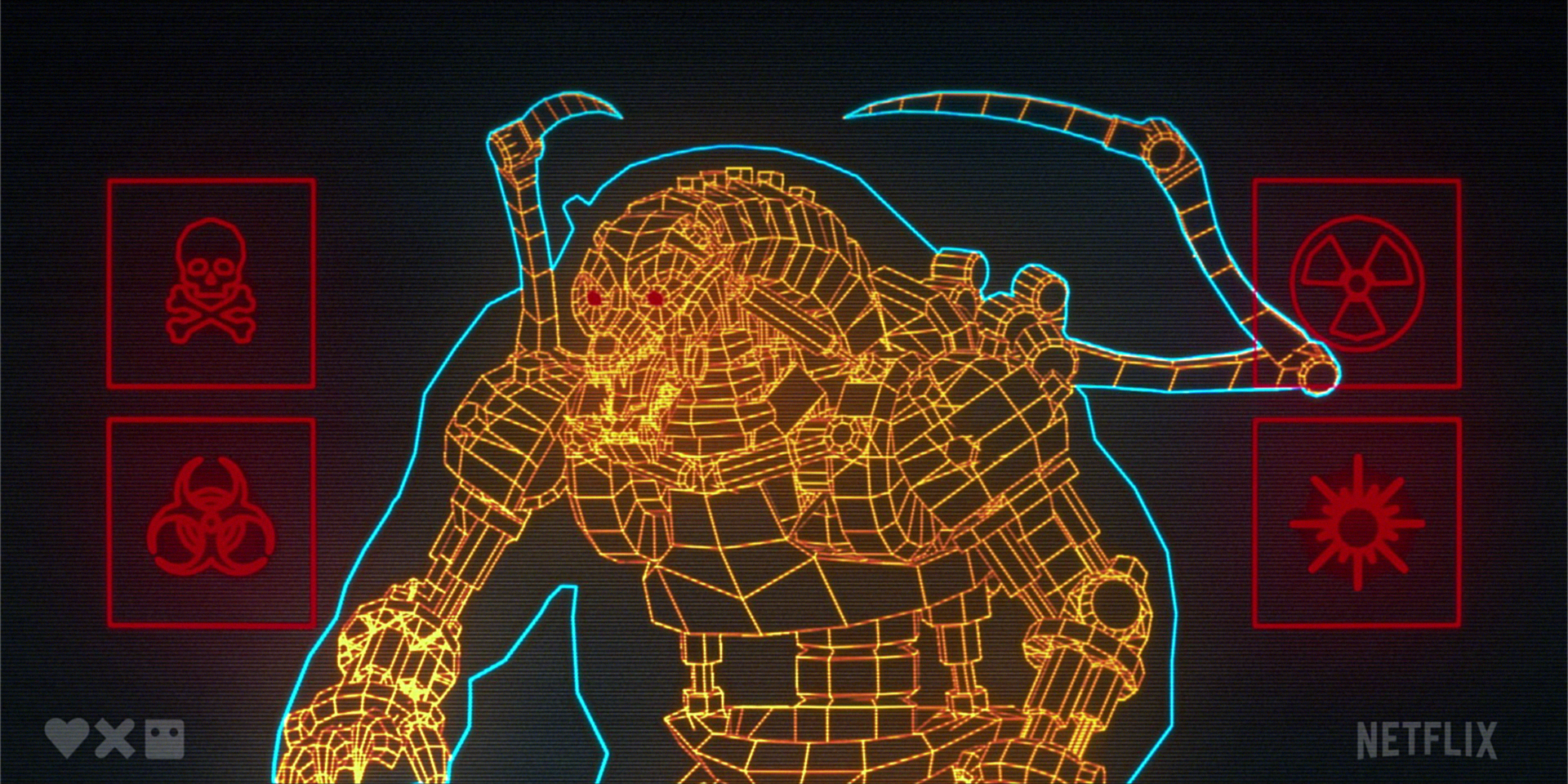
Love, Death & Robots is so unique since it has such varying aesthetics per episode. We took a very simplified approach to Kill Team Kill's anime art style with the Barghest Diagnostic screen. The design and animation were inspired by old school lo-fi tech screens from the ‘80s along with era-appropriate scanline compositing approach.
Designer Ramiro Galan
Credits List
Client Netflix Studios
Executive Producer Sean Cushing
Designers Kristoffer Brady, Ramiro Galan


